- Click here to download the guidelines in PDF format.
- PEER researchers with Year 8 projects, or Year 7 projects with no-cost extensions, are required to present a project poster at the 2005 PEER Annual Meeting.
- One poster is expected for each funded project.
- Principal Investigators are responsible to ensure that the poster is presented by participating students.
- The project posters will be featured during the reception/poster session in the evening of the first day of the Annual Meeting, Friday April 29, 2005.
Poster formats are identical to those used at last year's annual meeting held in Palm Springs, with the following exceptions:
Instead of providing foam-core boards to paste the posters onto, we will have large free-standing posterboards to which posters my be pinned or affixed with velcro.
No footer stickers (stickers with the Annual Meeting logo that are affixed to the bottom of the posters) are being prepared this year. Instead, we have made the footer into a graphic that you can download and include with your poster. The footers provided below may be inserted into your poster document electronically and printed as part of the poster. Click here to move to the file download area at the bottom of this page.
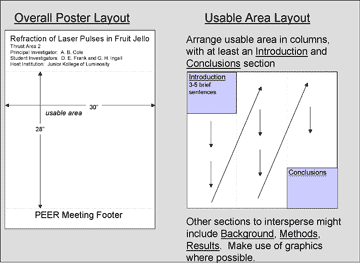
Each poster will be allocated a 32" wide X 48" tall area on a posterboard. Please ensure that your poster will fit in that space. We recommend using the same poster dimensions as in past years: 30" wide X 40" high. Using those dimensions as a guideline, posters should be organized as follows:
The first 8" across the top of the poster should include (1) the Project Title, (2) Thrust Area or Lifelines Topic Area that the project is associated with, (3) Principal Investigator(s), (4) Student Investigator(s), (5) Host Institution. The bottom 4" of the poster board is where the footer graphic (available via download below) should be inserted, so your effective working area excluding the 8" at the top and 4" at the bottom is 30"X28". See the image below for a graphical depiction.
 Guidelines on developing effective posters can be found at various online sources. An interesting quote from an online resource: "It takes intelligence, even brilliance, to condense and focus information into a clear, simple presentation that will be read and remembered. Ignorance and arrogance are shown in a crowded, complicated, hard-to-read poster."
The main body of the poster should include at least an Introduction and Conclusions. Possible sections between the Introduction and Conclusions include Background, Methods, Results, etc.
See http://courses.washington.edu/~hs590a/modules/19/ppposter.html for some ideas on different combinations of headings. Graphics are always preferred to lengthy text. On the other hand, some brief text, readable from a distance, can be useful to describe the graphics. See the figure below for an example of how a poster might be laid out. Of course, you are encouraged to create your own, well-organized, informative, attractive designs. Pushpins, tape and velcro will be available at the meeting.
2005AM_footer.psd <4.29M>
2005AM_footer.jpg <561K>
If you have any trouble with the poster footer graphic, please feel free to contact Jason at the Outreach Office by email (peer_ctr@peer.berkeley.edu). The graphic should look like the one below.
